
This RMIT project was to create a Surrealist themed Paper Sampler Range For Spicers Paper, with the target audience being graphic designers and printers. The aim was to create Surrealist compositions as well as a Logo to promote the paper samples.
My Concept
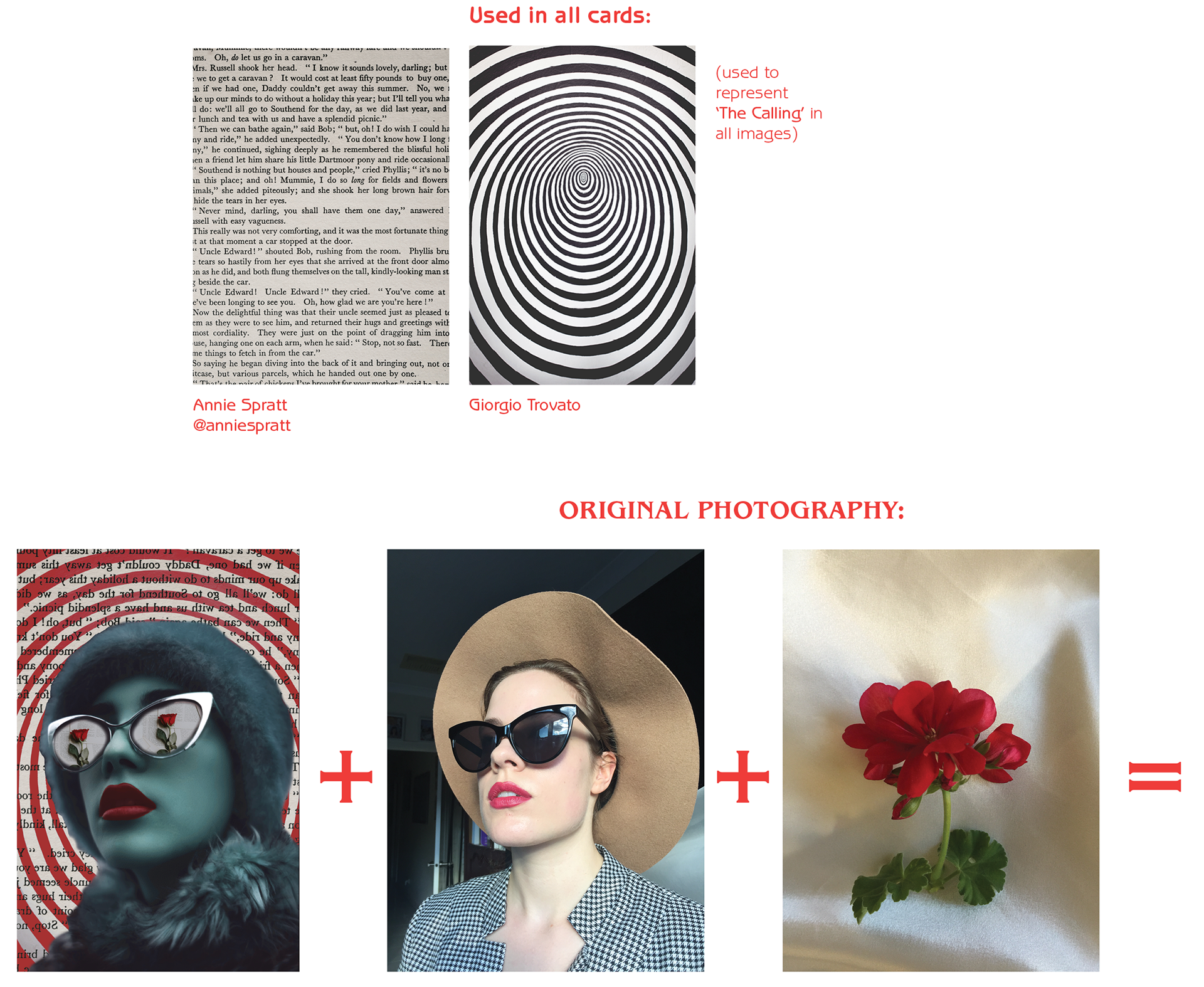
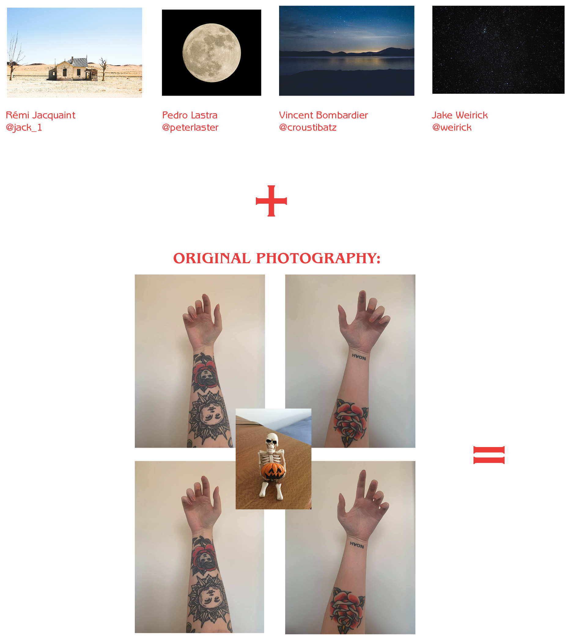
CALLING CARDS : The experience that graphic designers feel when going through the motions of life, of the magnetic pull to certain interests and choices. When something feels natural and catches your attention, it ‘calls’ for you.
I thought this was a notion that graphic designers could easily relate too, the endless pull towards creatively that almost feels ominous in nature like an intangible calling card. The primary neon red and blue colours, being opposite colours, were striking and surrealistic, representing the dichotomous ‘push and pull’ but also stripping down to the basics of primary colours in design and printing.
SOFTWARE USED:
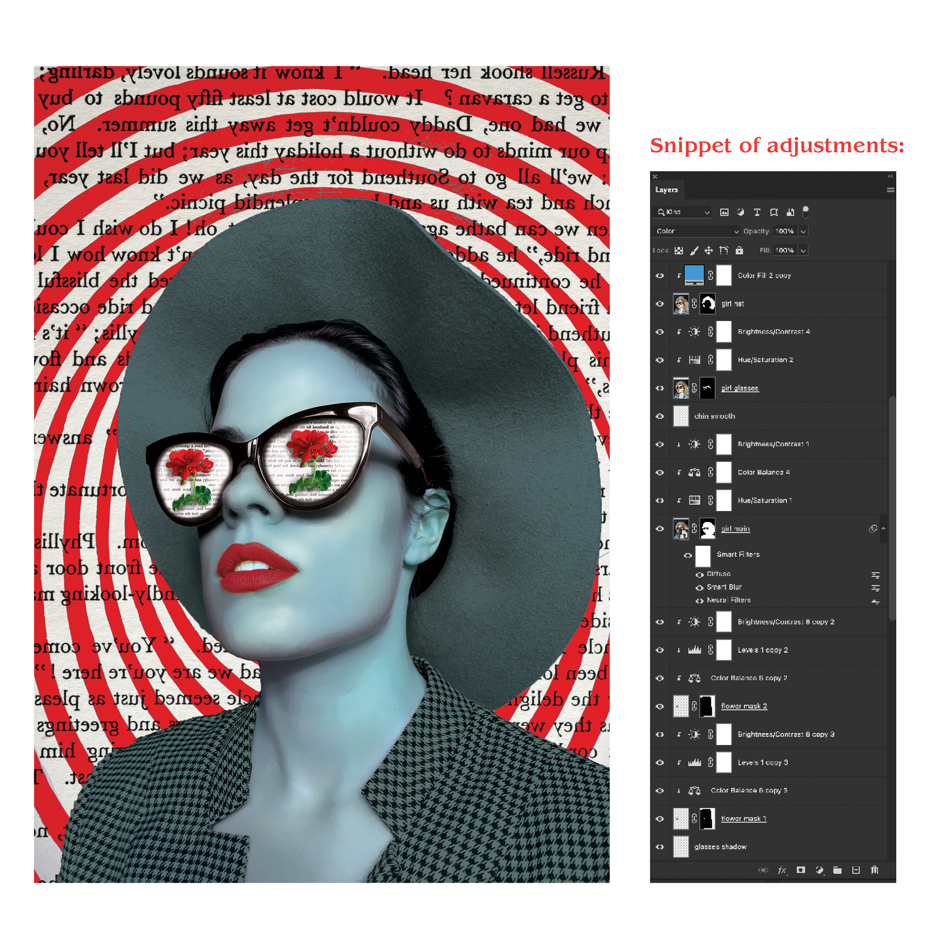
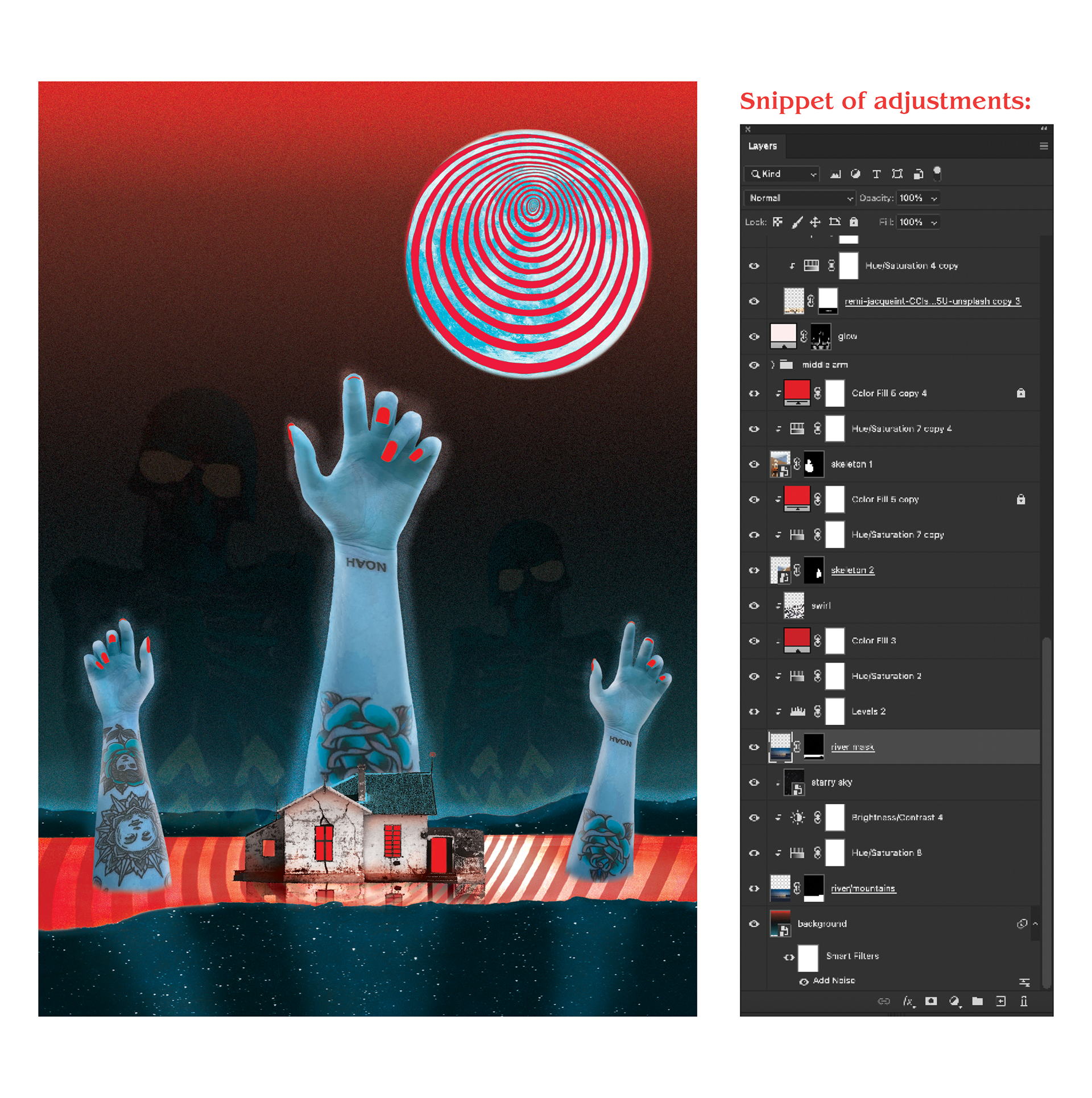
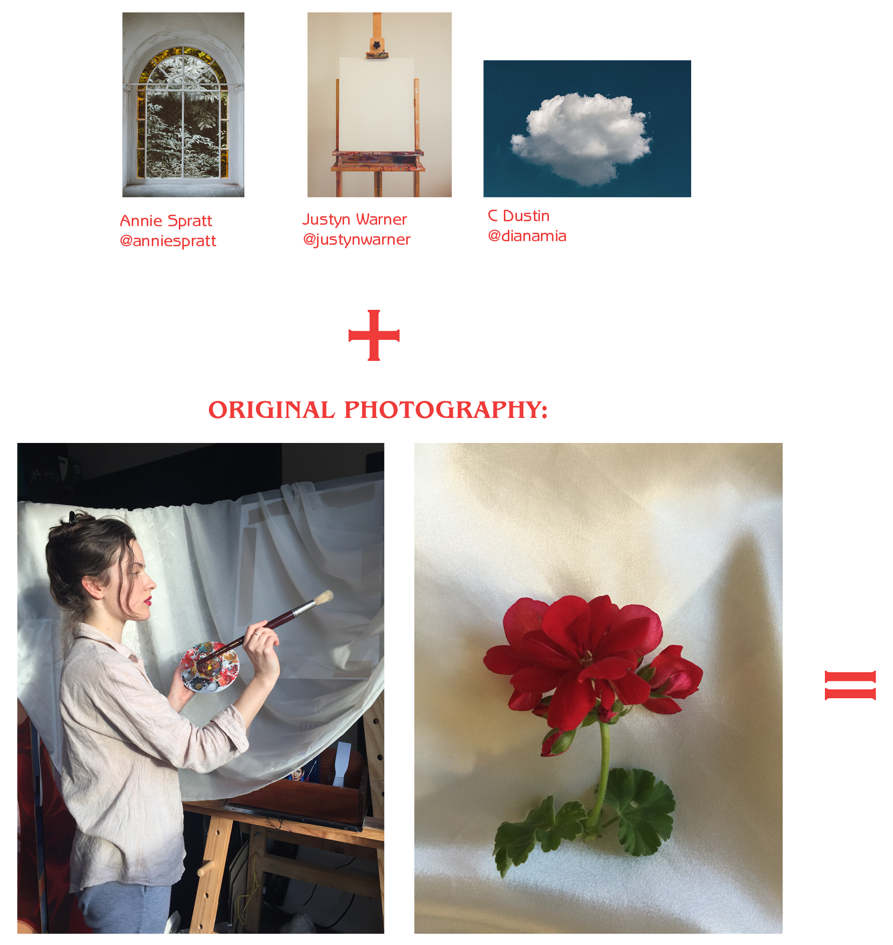
Photoshop • Illustrator • Indesign • Photography

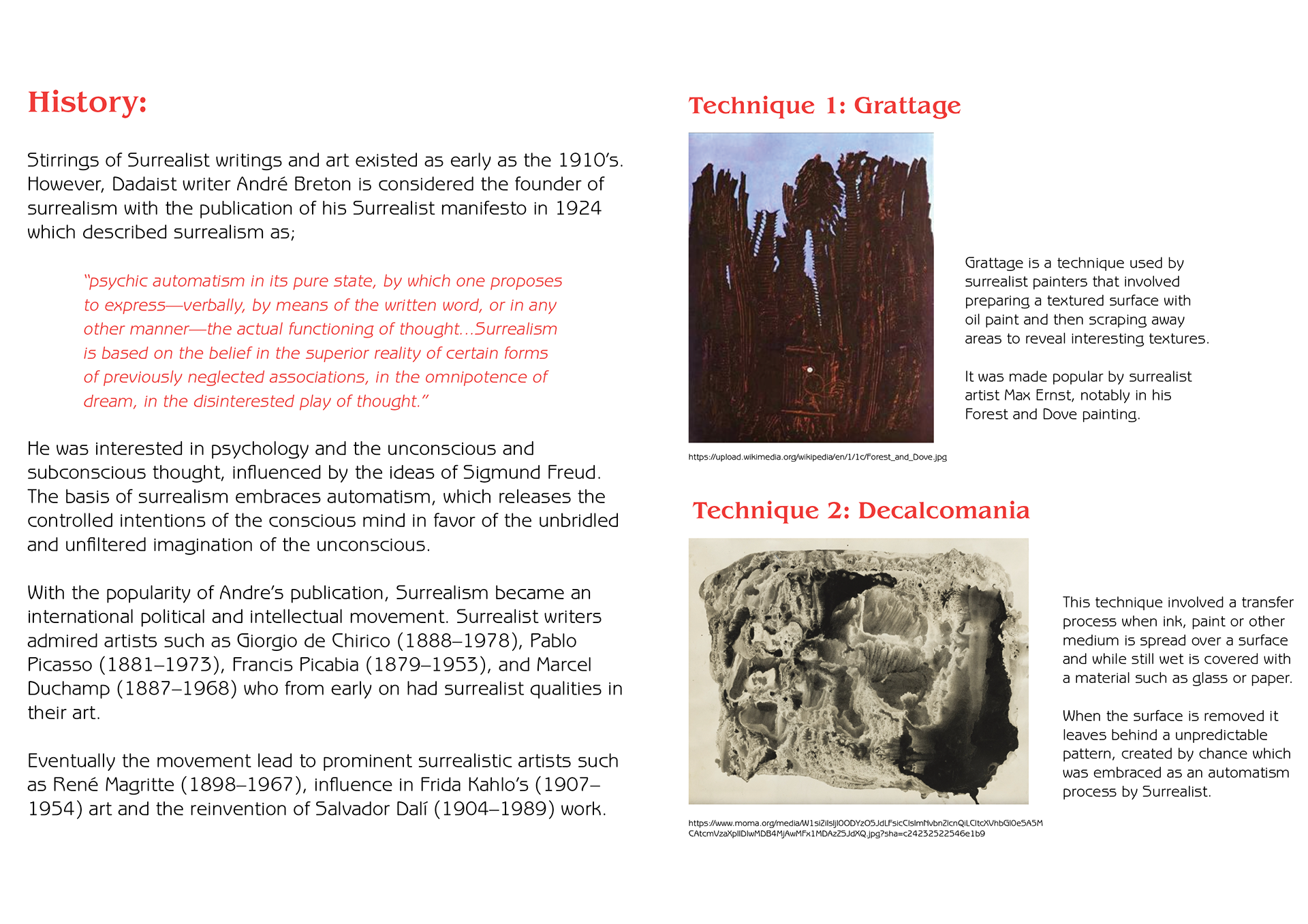
What is Surrealism?
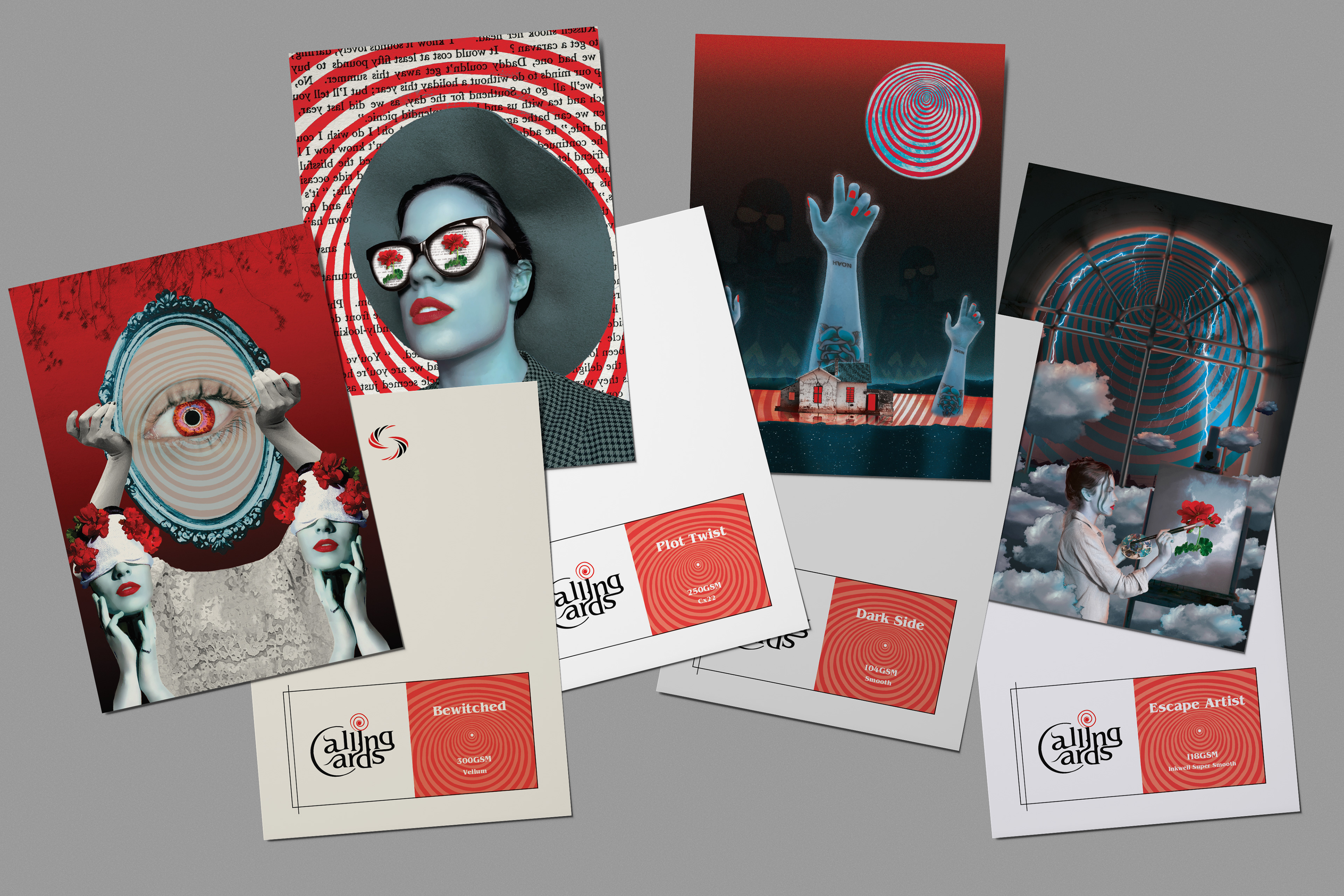
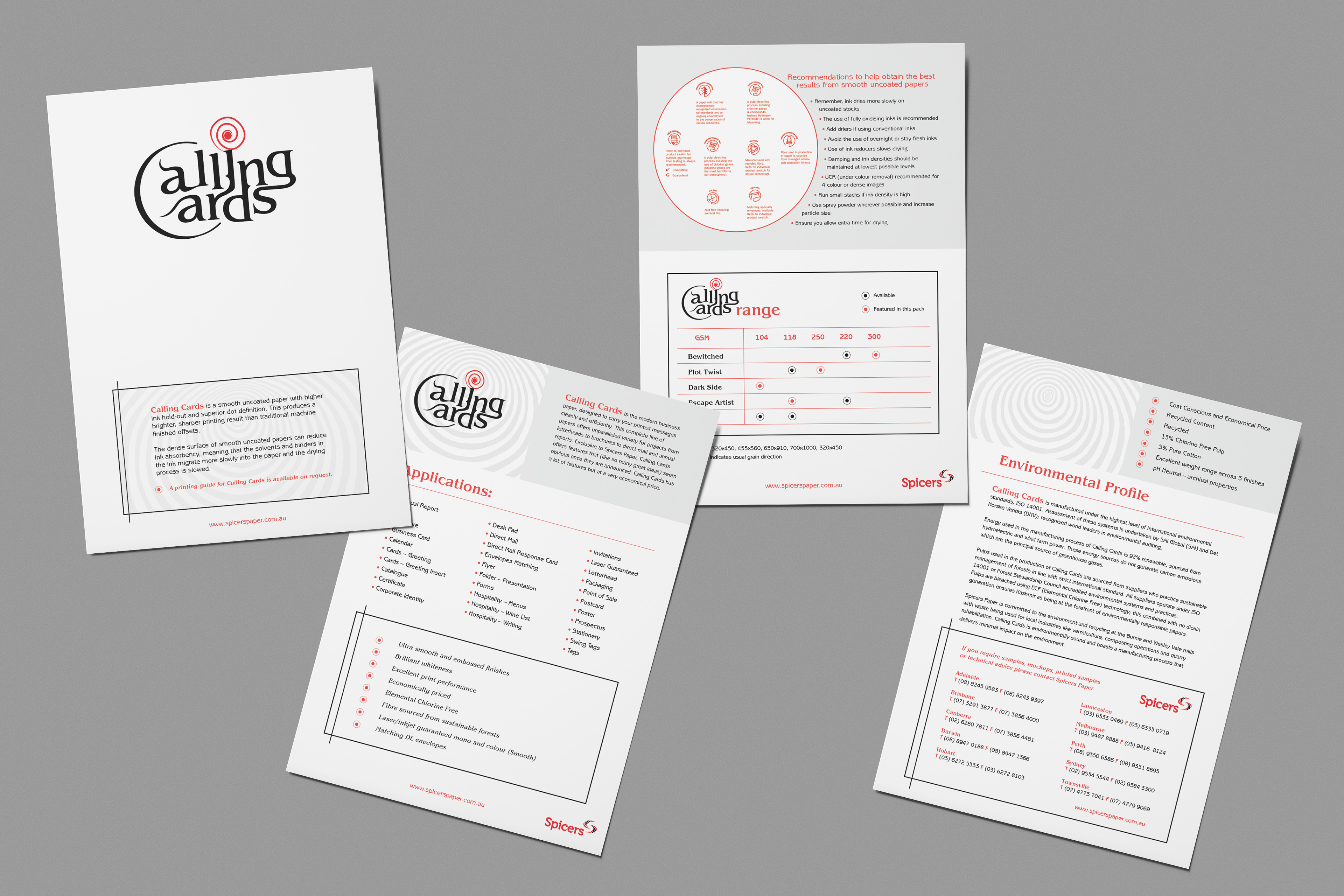
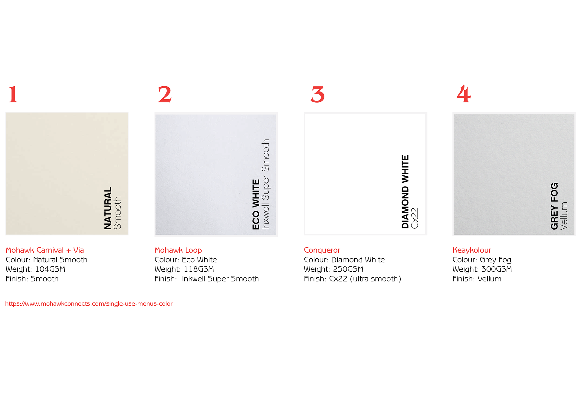
Paper Sampler Range
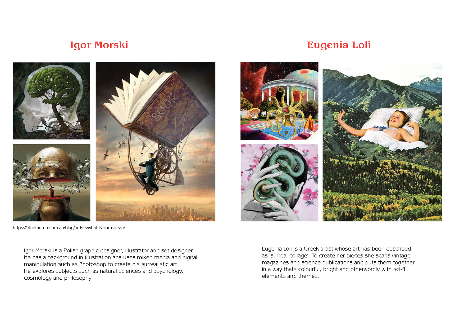
Figures of Inspiration
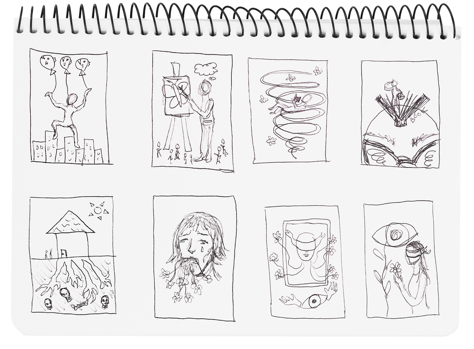
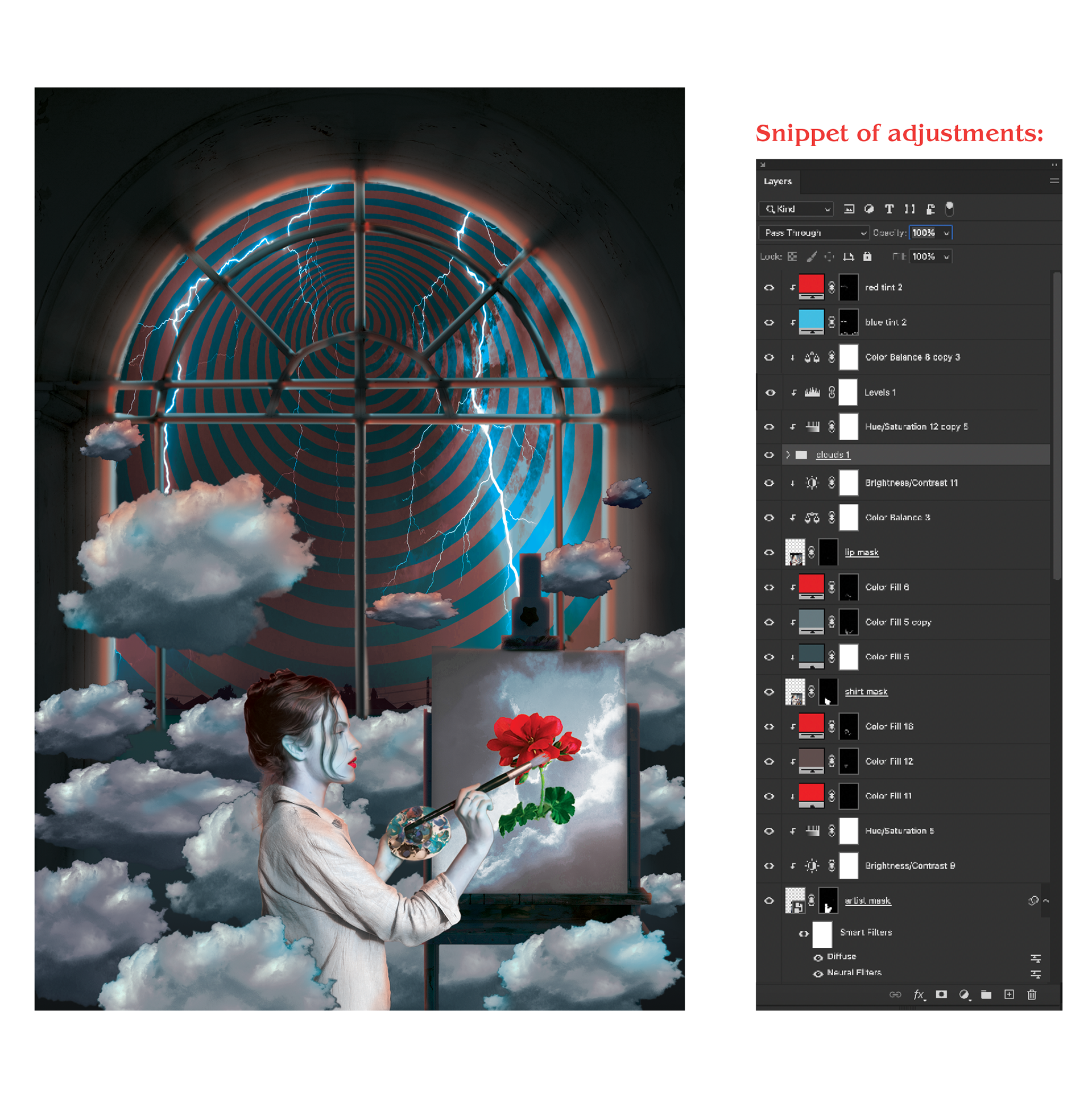
Process
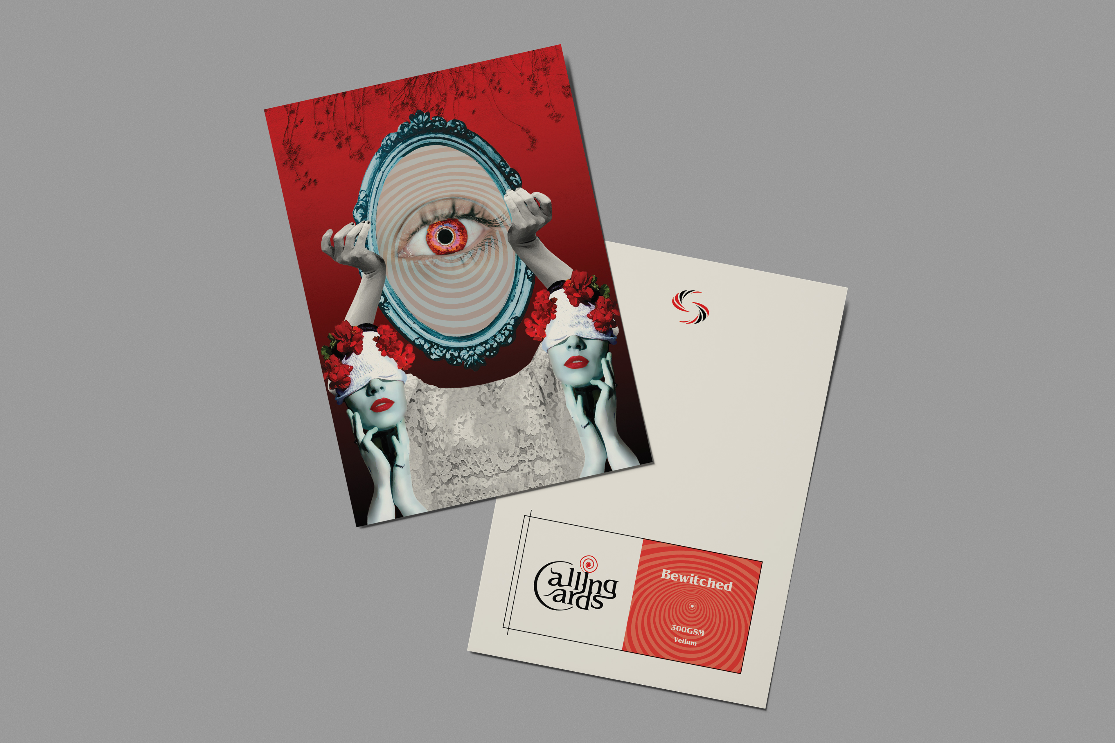
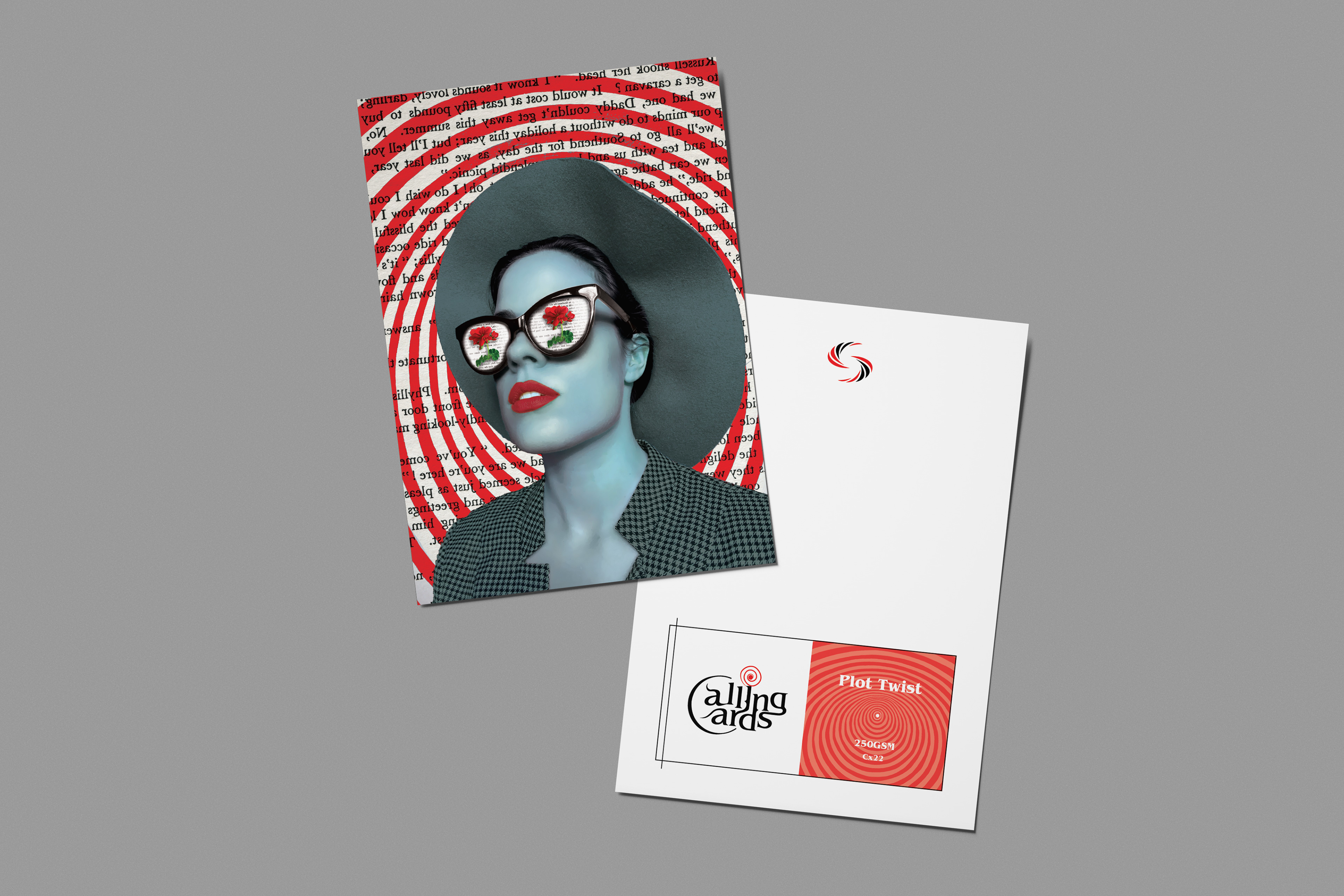
4 Calling Card themes and meanings:
Bewitched (beauty, symmetry, perfectionism)
Plot twist (storytelling, visual narrative, hook)
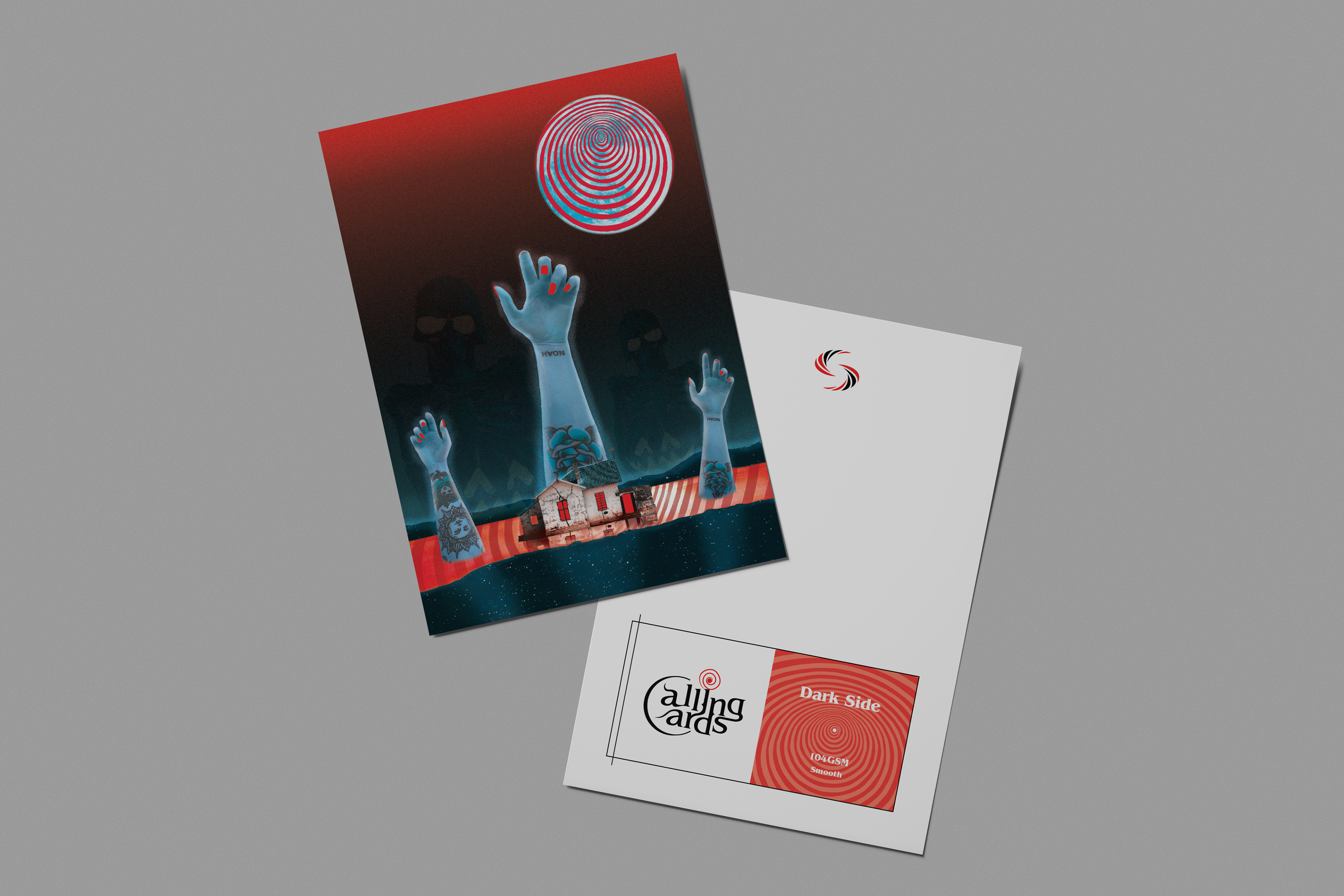
Dark Side (isolation, twisted ideas, ugliness)
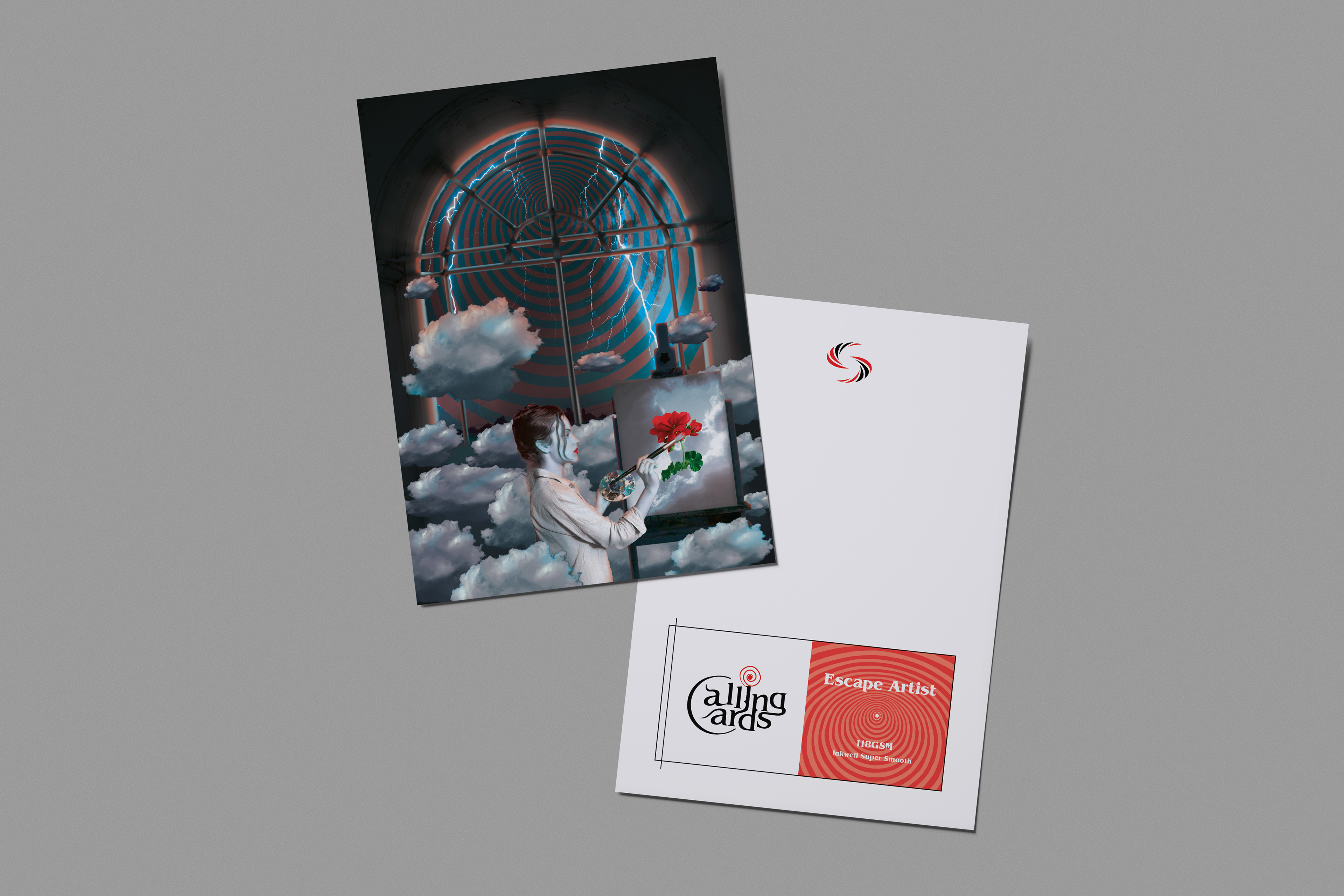
Escape Artist (dreamer, escapism, hyper-focus)

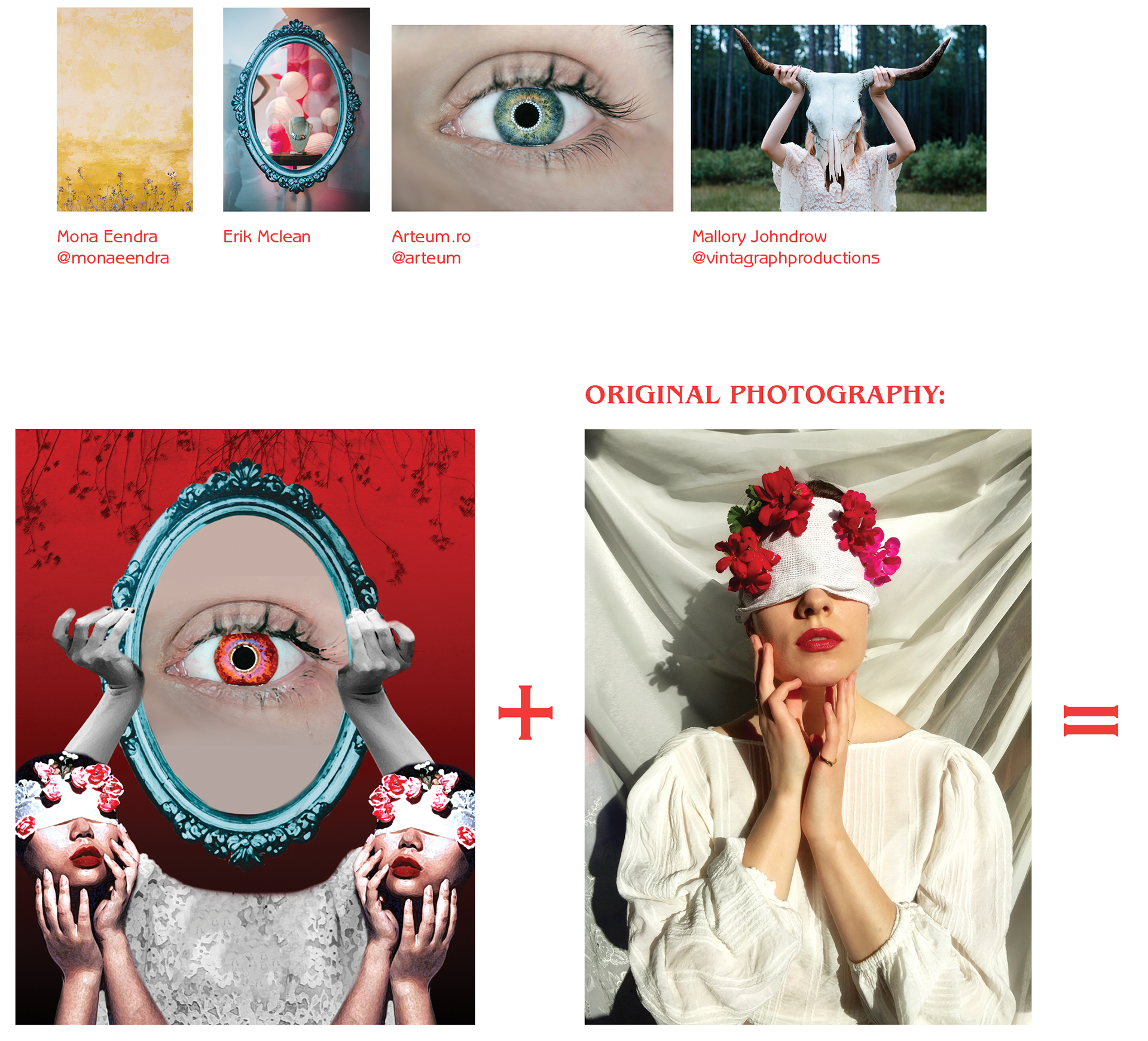
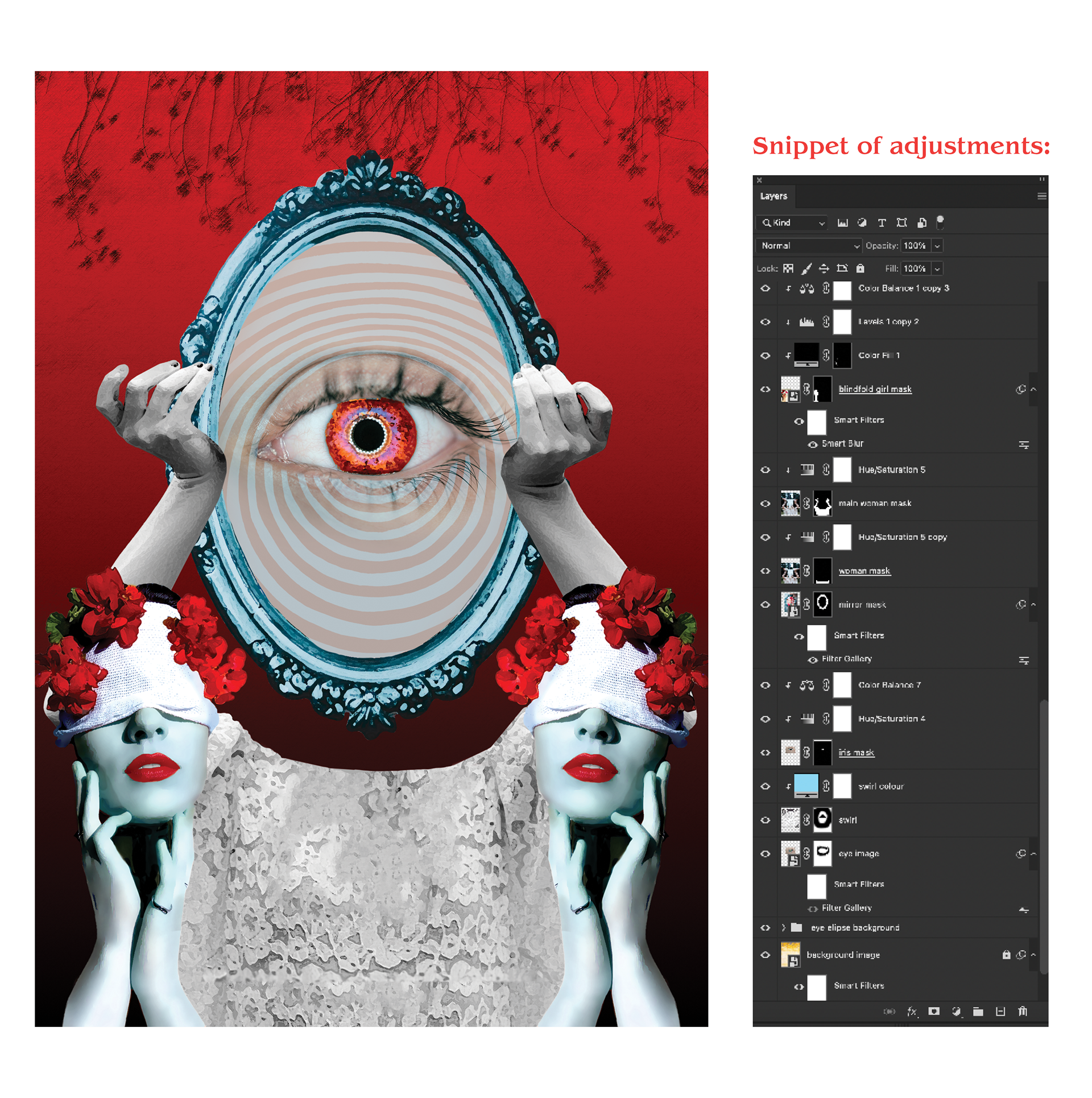
BEWITCHED (Card 1)
PLOT TWIST (Card 2)
DARK SIDE (Card 3)
ESCAPE ARTIST (Card 4)
Outcomes